
As I’m writing a fair bit about my photography techniques, then I though one good thing to touch on for todays post is how I edit my photos. The main piece of software that I use is a program called Adobe Lightroom, I think its one of the best programs out there for editing loads of photos at once, in fact I cant really think of a different program out there that might be just as good, to me it seems like Adobe have this corner of the market locked down.
What I tend todo with my photos is import all the stills I took that day into Lightroom, literally its just a drag and drop thing and then start working my way through the photos. one thing that I have noticed with my editing is that I like to play around with the highlight tool a lot and play around with the exposure. i start by going from one extreme to the other, playing with the dials on the right hand side going up and down the dial till I get to a point where my happy with the photo. once Ive played around with the lighting, I then move onto the colour in the photo and because this is an iphone photo, the White balance is auto so I cant really play with that, but the saturation, vibrance and clarity can all be messed about with. The clarity is something I don’t really like to change to much, I find that it makes a photo too grainy or too blurry and I normally use it a lot more if a photo is out of focus, kind of like a safety net. Saturation and vibrance are something I normally like to bring down, i love taking colour of the photos and give them that faded look and if you have read some of my previous blog posts you will have read the reason why I like faded photos so I wont go into those details now, just read some of my previous post and im sure you will see why.
I hope thats helped you to quickly understand what I do to my photos and maybe if you guys want to know more I can do a more in detailed post about this.
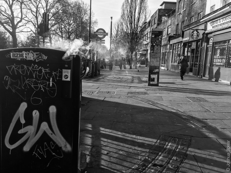
heres my examples and also some print screens of the editing process.


very cool and nice to see all the different ones – and while sometimes contrast is good – I can see why you are not a big fan.
my takeaway is how cool the smoke looks in various versions – such a cool photo to see different versions of….
LikeLike